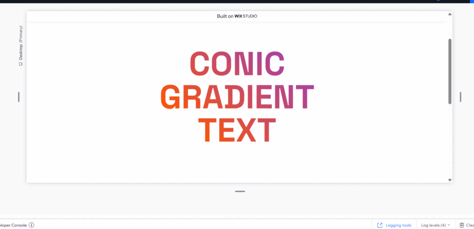
The following code creates a rotating color change animation. It changes the color in a circle in a text element.
Add the colors in code
background: conic-gradient(from 0deg, #00f5d4, #7209b7, #3a86ff);Control the time of animation from code line
animation: rotateGradient 5s linear infinite;and control the rotation gradient colors in the code
0% { background: conic-gradient(from 0deg, #00f5d4, #7209b7, #3a86ff); } 100% { background: conic-gradient(from 360deg, #00f5d4, #7209b7, #3a86ff); }CODE
.css-tutorial {
   background: conic-gradient(from 0deg, #00f5d4, #7209b7, #3a86ff);
   -webkit-background-clip: text;
   -webkit-text-fill-color: transparent;
   background-clip: text;
   animation: rotateGradient 5s linear infinite;
}
@keyframes rotateGradient {
   0% { background: conic-gradient(from 0deg, #00f5d4, #7209b7, #3a86ff); }
   100% { background: conic-gradient(from 360deg, #00f5d4, #7209b7, #3a86ff); }
}