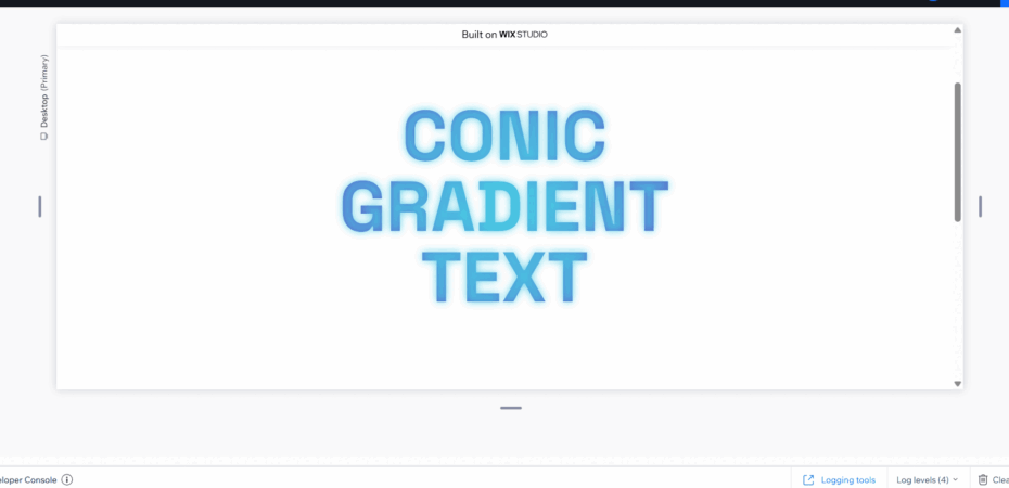
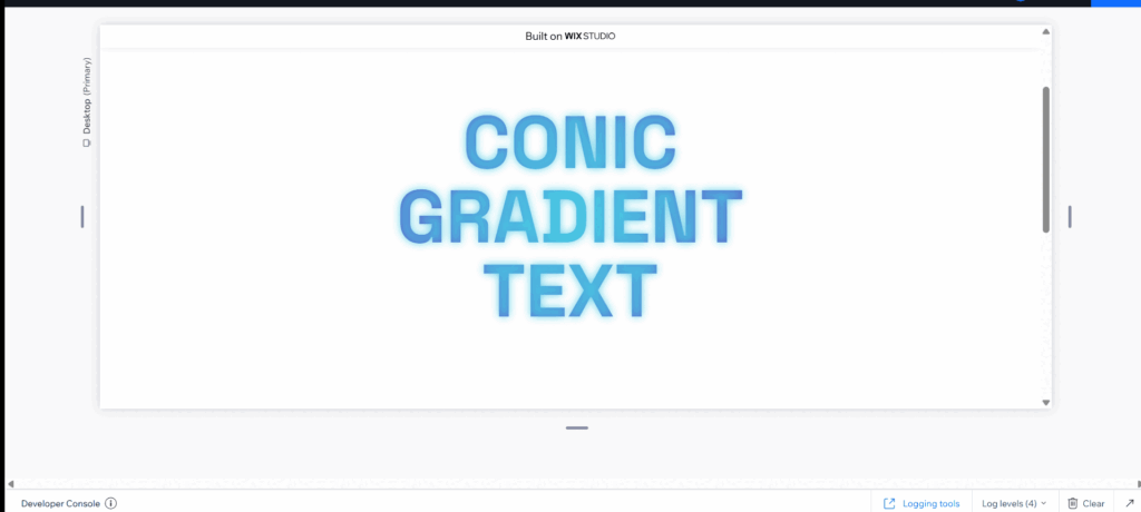
This code adds a subtle glow to the text. It looks very good with the accent colors.
Chanhe colors in code
background: radial-gradient(circle, #48cae4, #7209b7);Change Glow Time In Code
animation: glow 2.5s ease-in-out infinite;Change Shadow Settings in
0%, 100% { text-shadow: 0 0 5px rgba(72, 202, 228, 0.5); } 50% { text-shadow: 0 0 15px rgba(72, 202, 228, 1); }Full Code
.css-tutorial {
   background: radial-gradient(circle, #48cae4, #7209b7);
   -webkit-background-clip: text;
   -webkit-text-fill-color: transparent;
   background-clip: text;
   animation: glow 2.5s ease-in-out infinite;
}
@keyframes glow {
   0%, 100% { text-shadow: 0 0 5px rgba(72, 202, 228, 0.5); }
   50% { text-shadow: 0 0 15px rgba(72, 202, 228, 1); }
}